We’ve Seen It All Before… Haven’t We?!
Locked inside of our sanitised abodes, we’ve all been feeling a bit nostalgic. Life used to be so simple, didn’t it? Remember back when burger joints just wanted to sell us burgers? They weren’t telling us to get the hell away from each other or brag about how mouldy their food gets.

In the good old days, fast food eateries were all about showing us the greasy goodness that inspired us to pull out our wallets and open our mouths. Now, finally, they’re getting back to the heart of it. Smart brands are going back to their original look and feel, and I’m lovin’ it.
Taking a Leap Back in Time to Bring Brands Forward
Since the mid-2010s, we’ve been seeing everyone from Kodak to Coca-Cola embracing their roots during rebrands. Much like 90s movies remakes, these throwback revamps are being met with mixed reviews.
On one side, people are nostalgic. They fully embrace and appreciate the brands that are going back to move forward. Retro fans love that brands are holding onto their roots. On the other side, we’ve got critics calling them out as copycats. They think it’s a lazy rehashing of the same old crap we’ve already seen. While you’ll definitely find some solid examples of completely unexpired rebrands, you’ll also find a selection of thoughtful and quite frankly GENIUS throwback brands.
Have It Your Way
The Burger King rebrand by JKR was the company’s one and only rebrand in 20 years... and it’s a whopper. The new logo is ALMOST the spitting image of the branding they used all through the 1970s, 80s (as seen in Stranger Things for those of you not born then) and into the 90s.
You can feel the retro vibe from the packaging to the signage to the uniforms, but it is not quite the same as it was…

The new bun is now softer, fluffier, and plumper while the new font was designed to be "rounded, bold, yummy" and, actually, it works. Echoing the voluptuous curves of those questionably ‘delicious’ ingredients, if there is a font out there that could spark your appetite, I’d say this one will do the job.
The new style set out to be simple and fun --- and what more should a fast-food brand really aim for? It’s fresh and tongue-in-cheek. Like how it’s now chic to wear oversized sweats and orthopaedic trainers, it’s hard not to love the easy, familiar style.
The Same, But Totally Different

Anyone who went through the rite of passage of getting a job at a fast-food joint might be struck by a couple of things about these new ads. First of all, unless you were too posh to flip burgers, you probably remember way back when visible tattoos, piercings, and even nail polish were serious no-nos.
Checking out the throwback style ads though, you’ll notice right away that one of the main models has a nose ring and, at minimum, a solid start on a tattoo sleeve. It’s almost like they just (gasp!) grabbed a couple of real people who actually work at BK and put them in the ads. These are a far cry from the supermodels you’d see in the ads from the 70, 80s, or even 90s.
It's worth mentioning as well that the people in the BK pics actually look like the people in your average Burger King. According to their brand data, their core customer base tends to be younger black men. Scrolling through the new branding materials, you get a sense that they made a real effort to represent their customers with their brand models. It’s a brilliant example of embracing your existing customer base while keeping it fresh and relevant to every potential demographic.
And we haven’t even sunk our teeth into the rest of the new BK assets from the macro photography to playful illustrations by Cachete Jack.

The scrumptious typeface and saucy style used on the new packaging wraps to advertise the ‘tender crispy’ ‘melty juicy’ ‘cheesy bacony’ - well, who doesn’t want to rip that burger’s clothes off and... chow down?

Back to Basics
Nobody comes to BK expecting pomp and circumstance. Give us salty fries that are still hot and someone at the counter who will throw in a couple of extra packets of sauce and we’re on cloud nine.
In theory, I suppose there are people out there who legitimately don’t like deep-fried delights. In reality, however, I’d say most people who avoid eating out of a greasy paper bag are shunning fast food to get away from the mystery meat and eternally young, never-moulding ingredients.
JKR took this into account in the BK rebranding. They ditched the blue in the logo and removed everything that felt synthetic or artificial. Instead, they harkened back to a time when food was brought out by girls on rollerskates (or so the movies tell us).
The Less Golden Age of Film
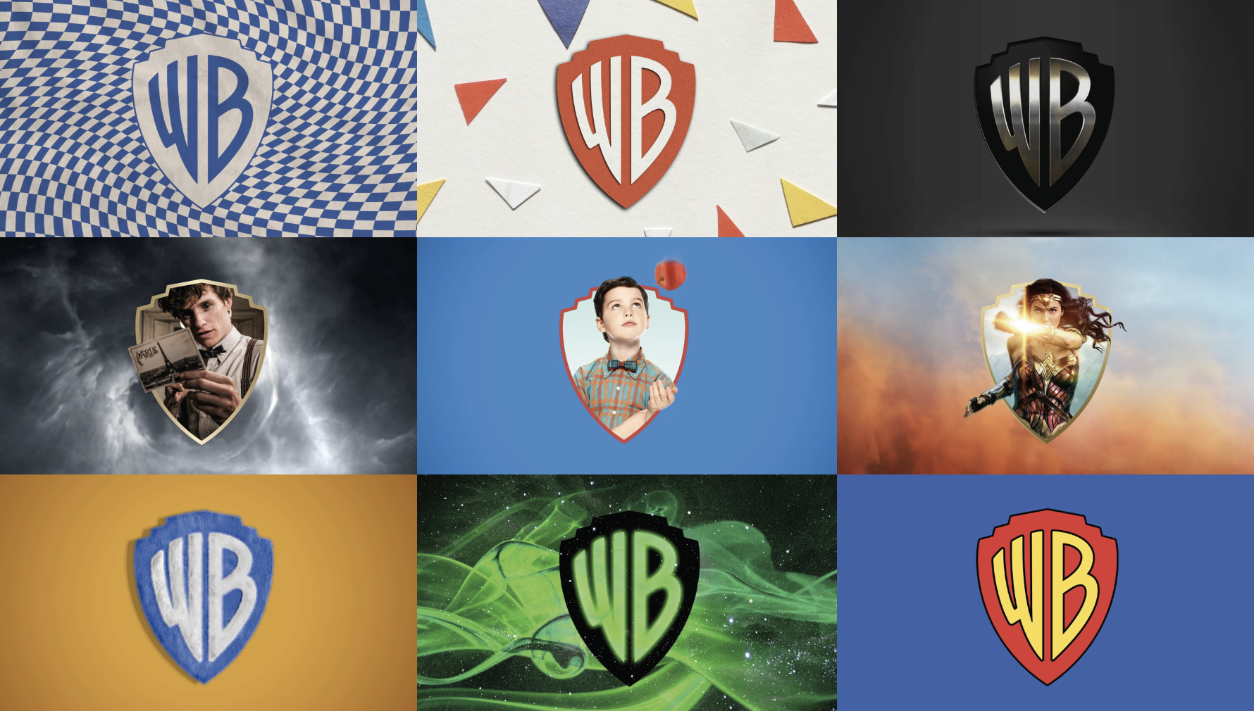
Another brand turning back the clock is Warner Brothers. The rebrand for Warner Brothers by Pentagram knocked a century off the iconic company’s age. In fact, their 2021 style is almost a dead ringer for the 1929 logo.

It’s yet another case of “if it ain’t broke, don’t fix it” and it works. In a smart move, they held onto that WB shield that even the most casual of movie fans would recognise in a flash. They created a custom typeface that replicates the style and now have a fresh identity based on an unforgettable past.
Their new style is based on the concept of the “power of story” and now you’ll see that quirky little shield with characters’ faces inside. It’s ultra adaptable yet consistent --- the holy grail in brand design.
Ready for the Small (Maybe a Bit Dirty and Scratched) Screen
The big screen of the cinema is a distant memory. As much as we miss the smell of popcorn, we’ve traded in those sticky floors for the comfort of our living rooms. With that, WB needed a simple logo that works on whatever screen we happen to have in front of us.
Like the Burger King rebrand, they not only looked to the past but to a more simple style that reflects the present and their real customer base. The faux gold with its weird fake shine felt dated and totally out of place on a whole lot of modern films. They dropped the three-dimension style of the classic logo in favour of a basic 2D that works everywhere.
Creating a New Future
In the world of design, we are seeing smart brands recognising that we live in a new era. We are now a generation of homebodies, like it or not, who are hungry for a simpler time. We don’t want our brands gilded or filled with artificial rubbish.
Throwback rebrand aside, what does the new world of design look like? Let’s talk ‘new school’ post-COVID (can we say that yet, please?) design.