CAMEL NUTS
BARS & RESTAURANTS
Nuts & Snacks - APAC
Brand Strategy, Brand Design, Packaging Design, Brand World Design
*Design Hungry in collaboration with
kousahandco.com and simonpendry.com
THE BRAND CHALLENGE
'Help us evolve an icon and create a more harmonious portfolio by bringing Camel Nuts - Singapore’s Nº1 nut brand up to date, thus targeting a younger audience without alienating our loyal customers who have been with us since we first hit the shelves in 1974.’

THE CONSCIOUS DESIGN SOLUTION
We had to be very sensitive in how we repositioned the Camel Nuts brand. The first challenge was to evolve the existing logo.
The brand had not be touched since its creation in 1974.


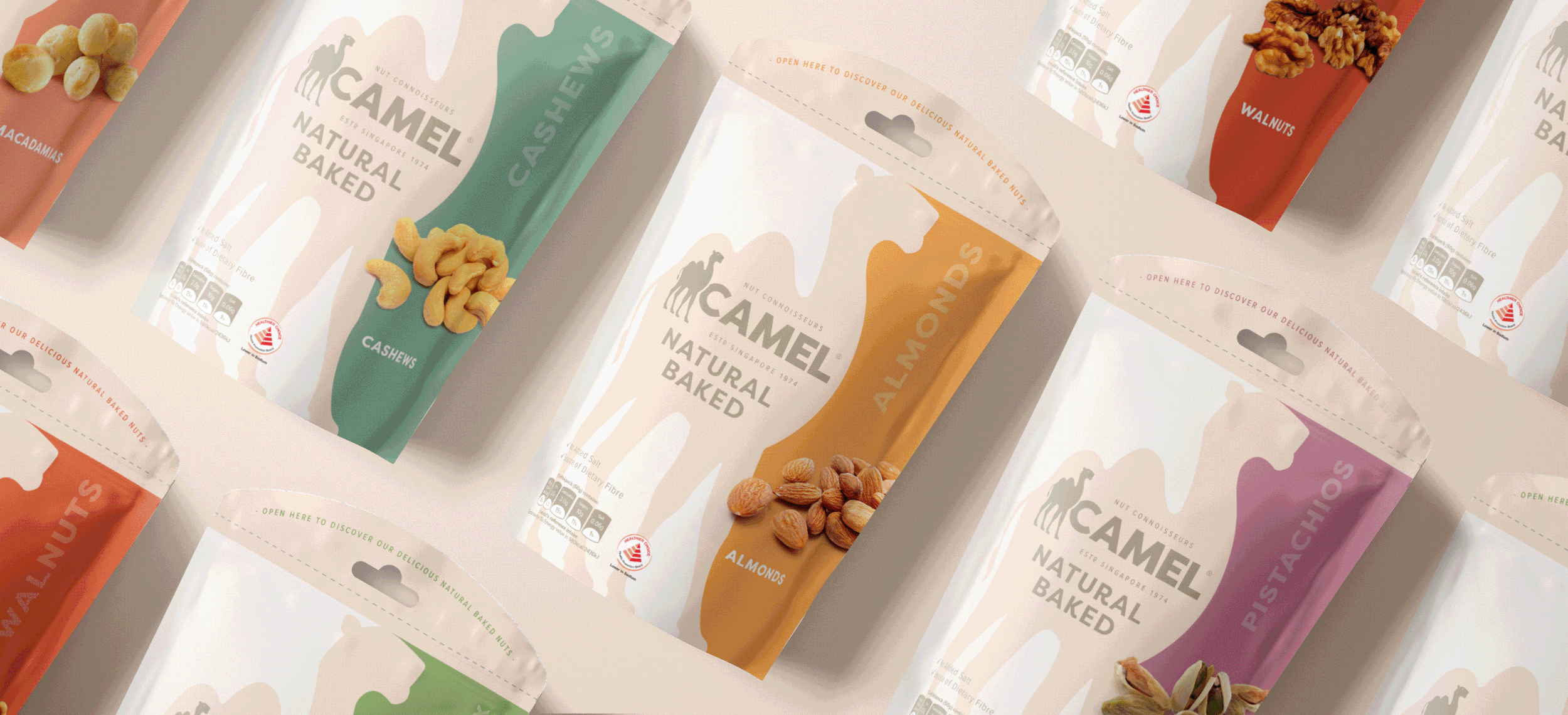
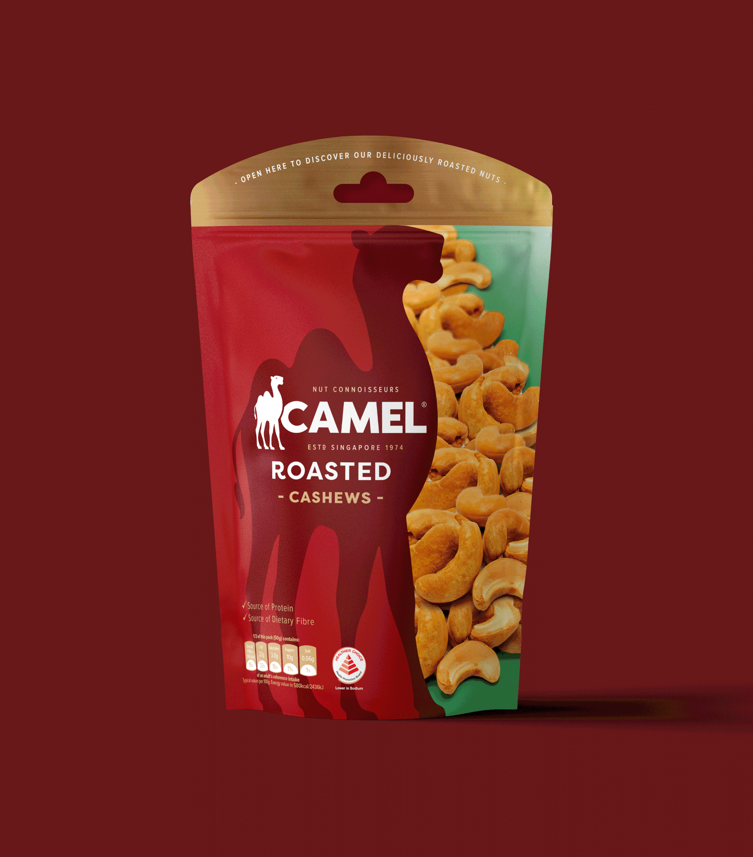
It was essential to retain the original character. We completely redrew the new Camel but keep the original structure of the logo creating a proud, contemporary brand. Adding the new tagline 'Nut Connoisseur’ and ‘Estd Singapore 1974’ helps new customers realise the credentials and rich heritage from one of Singapores longest running food brands.

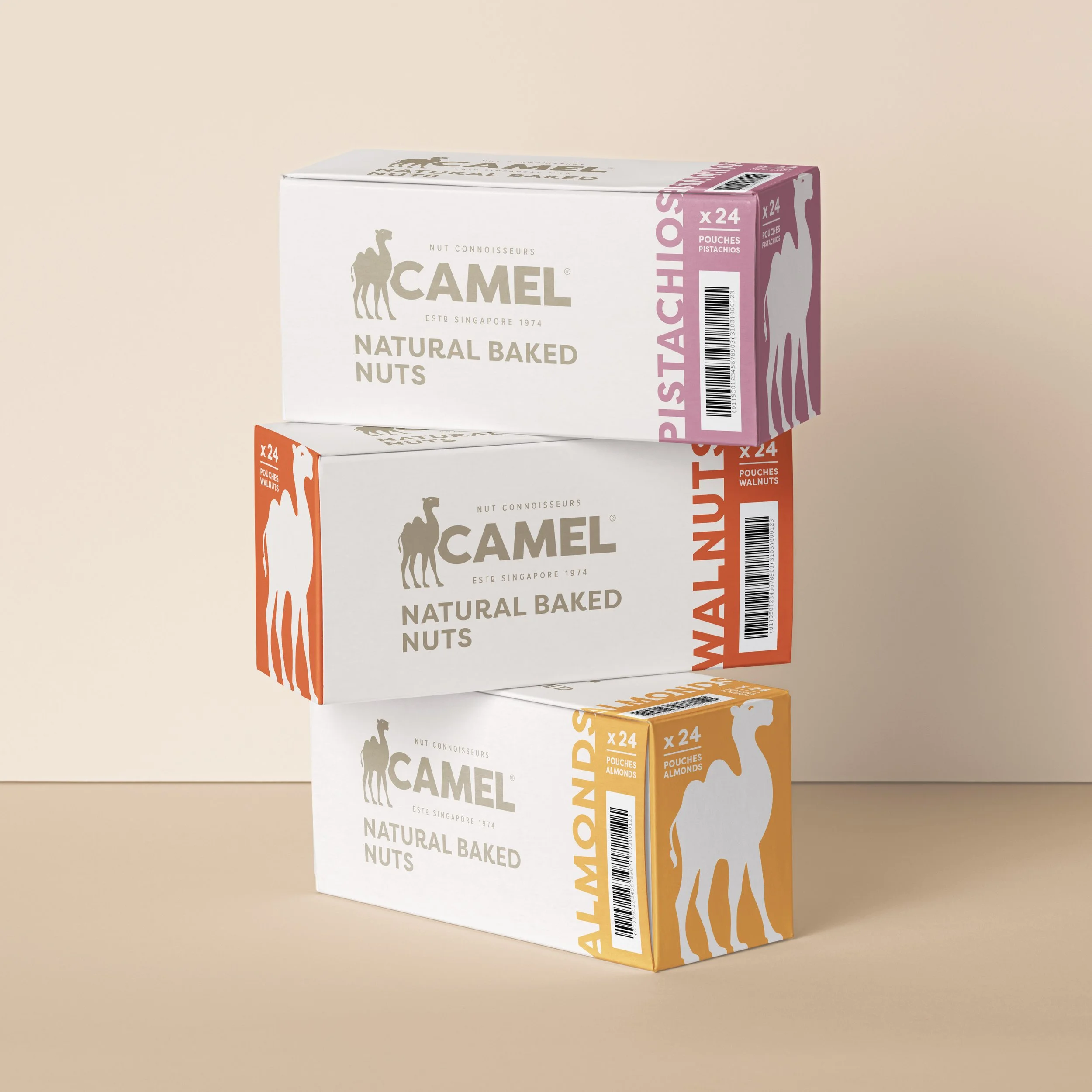
Our proud new Camel stands at the forefront of the packaging, allowing it to speak for its self. With over 100 products across 8 ranges, our new packaging had to bring clarity and consistency to the portfolio.
We simplified every ounce of information on pack and created a split colour background which makes for easy navigation and immense standout against its competitors!

IN CASE YOU WERE WONDERING
IN CASE YOU WERE WONDERING

BEFORE
AFTER

WHAT OUR LEGACY CLIENT SAID…
The team worked tirelessly from start to finish on the biggest repositioning and redesign in the history of our brand. I can’t recommend them enough.
We were told we could have the quality and dedication of big agency. We really feel we got this and more. We’re so excited by the new brand look and feel!
Shih Yin Poh - Director
camelnuts.com